Purely OT (2021)
DATE
2021
ROLES
Front-End Development
UI Design
STACK
Gatsby
Styled-Components
Sanity CMS
Netlify
About the project
Background
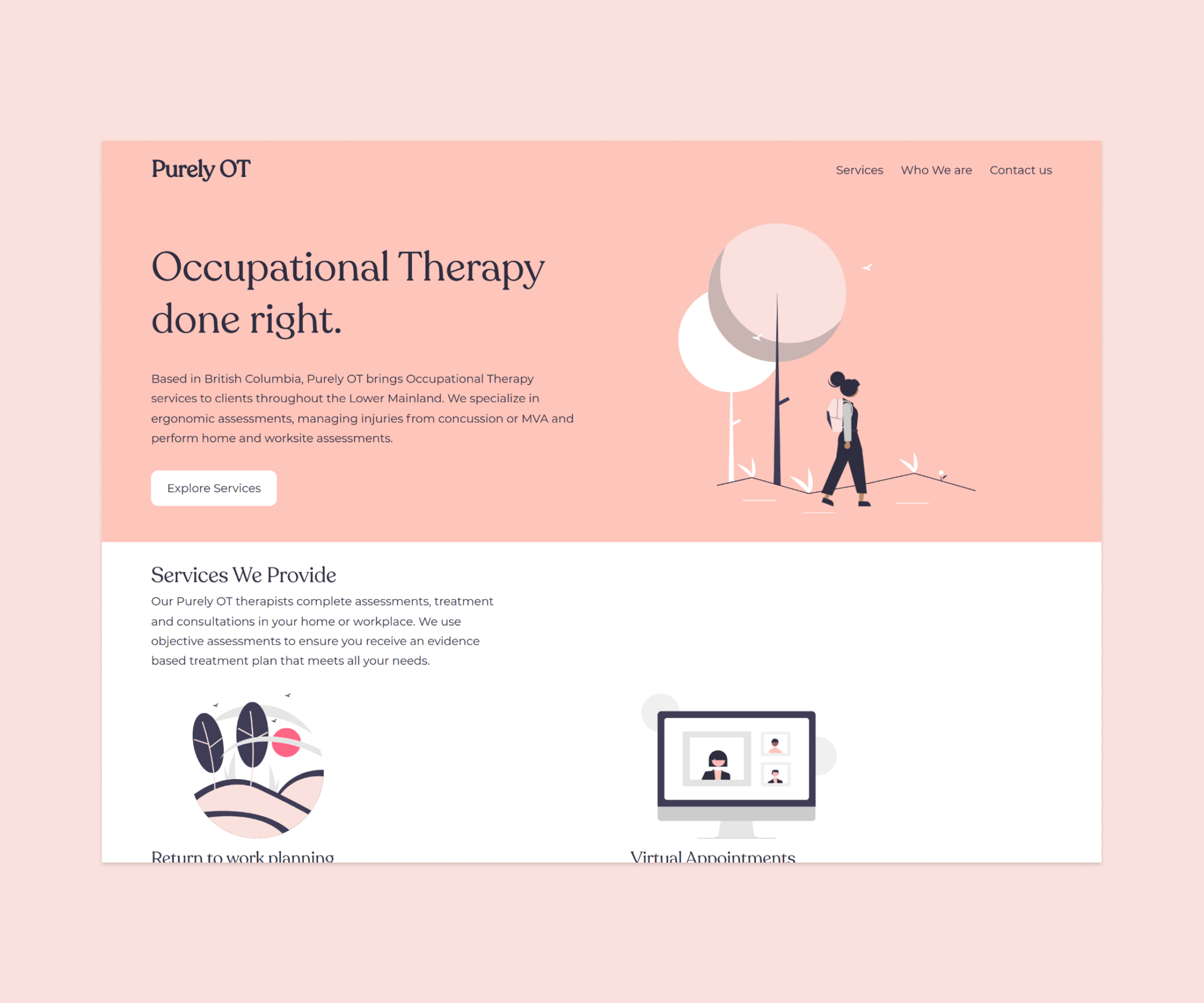
Purely OT is a Vancouver-based Occupational Therapy company, providing services to clients who have suffered motor-vehicle accidents.
PROJECT AIMS
This project aimed to build a landing page that will introduce the new company to potential clients, highlighting the services provided, company values, and a way to contact the head Occupational Therapist for referrals.
Tech Stack Explained
I decided to use Gatsby to build the site as it makes building static sites relatively easy, as it handles a lot of the website optimisation under the hood to ensure the site loads quickly. I also wrote the CSS from scratch, using Styled-Components to keep the CSS tidy and within each component file.
Another reason I used Gatsby was the ease of hooking it up to Sanity. Sanity is a headless content management system that allows the client to change the website content without the need of touching the code. After defining the content schema and deploying the customised Sanity content studio (which is hosted by Sanity itself), I used GraphQL to pull the correct data into each page, and then down to the individual components.
I also chose to host this website using Netlify, which (aside from hosting) ensured the website is using the secure HTTPS protocol as it automatically enabled a TLS certificate for the domain. I also configured the contact form to connect to Netlify Forms, which makes the form secure while requiring minimal configuration within the code.
Project Challenges
One of the biggest challenges for this project began before any lines of code were written. Defining the branding, including the font, colour scheme, and types of iconography were challenging due to the lack of modern-looking healthcare websites to use as a reference.
During my research, I found a lot of Occupational Therapy websites (and websites in healthcare) were using outdated design patterns such as uncomplimentary colour combinations, website text which was placed directly over images which reduced legibility, and lack of overall responsive design.
To combat these common mistakes, we decided to use a cleaner, more modern colour scheme, ensure the site was built using the mobile-first principle, and ensure that all website copy had the necessary colour contrast to be WCAG AA accessible.
FUTURE PLANS
The connection between Gatsby and Sanity will also allow the website to be easily expanded. The next phase of the project will include individual pages for company services, as well as a dedicated blog. Using Gatsby and Sanity, I'll be able to generate the necessary paths and create template pages that will pull the correct content for each service or blog.